My Favorite Programming Fonts
As a programmer, I spend a lot of time working on the computer. Most of my time spent developing involves using an IDE, text editor, or the terminal. Even when I’m not writing code, I work with text a lot, like writing this article, for example.
In the past, I didn’t pay a whole lot of attention to fonts (other than in web design), but I have definitely come around and realized how significant it is what fonts you use in your text editors and terminals. Using a font designed to be easy to read and clear can make the smallest difference in reading speed and legibility. And that difference adds up a lot when you work with text daily.
Over time I’ve tried out many different fonts; each one has its strengths and weaknesses. Some stick to the traditional Consolas look but with crisper rendering, others have a totally new look at an attempt to come up with the next big thing in font readability. I think it’s mostly subjective, but in my experience, some fonts really are better and can greatly reduce strain and increase clarity. Again, working with text over and over makes the font you use especially important.
In case you don’t want to do all the font-hunting and experimenting yourself, I will share some of my favorite fonts that I find to be most readable and refreshing. If you don’t like any of them, that’s fine. Go and find a font that fits you because there’s lots out there; just stop using un-anti-aliased Courier before you ruin your eyes.
Source Code Pro
Source Code Pro is a pretty popular font for text editing. Open sourced by Adobe, Source Code Pro is the monospaced, code-friendly version of the very popular font Source Sans Pro.
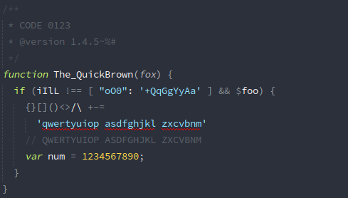
I used Source Code Pro for quite some time before I switched to Input. It isn’t very customizable, but it does come in several different weights and supports italics. It’s very legible and has a classic feel that reminds me of Consolas.
Input
My favorite on this list, and the font I will be using for the foreseeable future.
Input is a result of an incredible attention to detail and a feat of great design. It flows incredibly well; so well that sometimes I forget that the font was squeezed into a monospace format. For a programmer, it’s really important to be able to distinguish similar symbols apart in a split second, like l from I or 1. The designers of Input took special care to make sure that is the case.
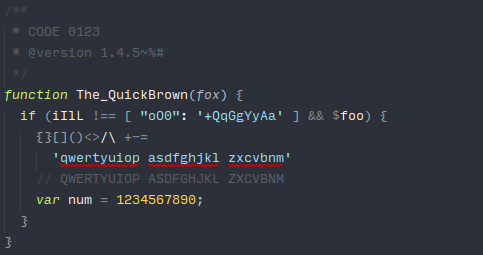
Input offers tons of styles and can even be customized when you download it. It has several different weights and styles and supports italics. It also boasts very good support for a wide range of Unicode character and terminal formatting characters, such as Powerline symbols.
An interesting idea behind Input is the creators’ advocacy for proportional fonts in coding. Most editors don’t seem to handle proportional fonts too well, so Input comes in three flavors: Input Sans, Input Serif, and Input Mono, which is essentially the monospace version of Input Sans. All three are programmer-friendly fonts, but I use Input Mono because the editor support for proportional fonts just isn’t there yet.
Inconsolata
Inconsolata is an open source font inspired by Consolas, a popular (and really nice) monospaced font by Microsoft that comes with Windows and Office. Consolas is the default font in Visual Studio, and for good reason – it looks good.
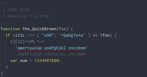
Inconsolata draws a lot from Consolas, so if you’re looking for a free alternative that you can use in Linux, then Inconsolata might be for you.
Courier Prime Code
A modern remake of Courier, Courier Prime is a set of fonts that re-imagine the original Courier font with modern features and variations. Like Source Code Pro, it maintains a very classic look while incorporating quality subpixel rendering and extensive Unicode support.
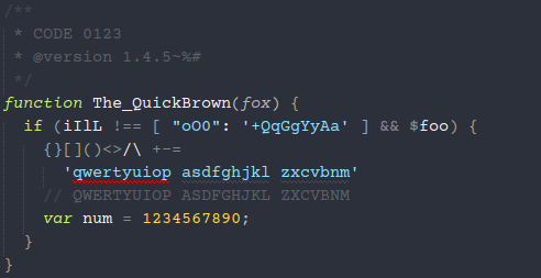
Supports a wide Unicode range and has an italic variant. The Courier Prime fonts are completely free under the SIL Open Font License (OFL).
Monoid
If you like really sharp fonts that work well under 9pt, then Monoid is an excellent choice. It is open source, supports ligatures, Powerline symbols, and has several styles and settings that can be tweaked when downloading.

I haven’t personally spent much time with Monoid, but it looks really good and I’ve heard some really positive things about it. And it has over 2,000 stars on GitHub!
Hermit
Hermit is probably the most unique font on this list. It has a personality of its own and is pretty quirky. I was skeptical when I first saw it, but it is surprisingly very readable and easy on the eyes. It really shines at small font sizes, where every normal character is still easily distinguishable, thanks to the blocky design.
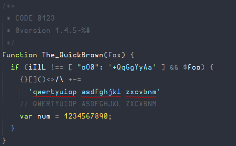
Hermit is open-source, supports the complete Latin-0 character set, and has dedicated Powerline symbols. It also features three thickness variations to suit your tastes.
Of course there are other fonts out there. If I didn’t list your favorite, it’s not because I think it’s bad; these are just my favorites. For the sake of those who are still looking for a font to stick with, please share the fonts you use with others.
Edit: Noted that Input Mono and Monoid come with Powerline glyphs.
8 comments
Let me know what you think in the comments below. Remember to keep it civil!
Subscribe to this thread
Recently switched to liberation mono, very good looking and free https://fedorahosted.org/liber…
Honestly I prefer the default DejaVu Sans Mono, with Ubuntu Mono in a close second.
I considered listing DejaVu here, since I used it for a time on Windows & Notepad++, but it didn’t make the cut for me.
I find Ubuntu Mono too curvy, but that’s just me.
my pick is Monoid, which supports nice ligatures on atom. Input for CLI.
Two comments:
Consolas works fine on Linux. It’s just a plain old font; there’s nothing OS-specific about it.
Support for proportional fonts is just fine in editors such as Atom. Although I normally use a monospaced font (either Consolas or my own Borg Sans Mono, which is Droid Sans with ligatures), I have experimented with proportional fonts in Atom (Andika is particularly nice), and found that it works quite well.
Update: I now have a plugin for Atom ( http://www.github.com/marnen/atom-andika ) to make using Andika with Atom easier. And Borg Sans Mono is now in the Fonts plugin for Atom.
I’ve also used Source Code Pro for 2-3 years, then switched to IBM Plex Mono for about 2 years. It’s open source: https://github.com/IBM/plex
Both fonts work fine for me. Except that I want to try new font, because, you know, I code all day long. New font will absolutely help.
Currently IBM Plex Mono has a bug with displaying these characters:
╔══╗ ║ ╚══╝
Then I found your website, and have just switched to Input. Thank you :-) By the way, all of my boxes made by above characters look perfect in Input. Thanks again,
Give Jetbrains mono a try, I have been using Source code pro since I started caring about fonts for code. Once I saw jetbrains mono I switched in a blink and never looked back it is really looking good and make reading easier. https://www.jetbrains.com/lp/mono/